
Creating responsive HTML CSS grid layouts is an essential skill for web designers and developers. With a grid layout, you can easily organize the content of your website in a clean, structured way. In this article, we will explain what a grid layout is, how to create one using HTML and CSS, and provide some examples of responsive grid layouts.
What is a Grid Layout?
A grid layout is a design technique used to arrange content on a webpage in a structured way. It divides the content into columns and rows, creating a grid-like structure that makes it easy to organize and position elements on the page.
Using a grid layout can make your website look cleaner and more professional. It can also make your site easier to navigate, as users can quickly find what they're looking for.
Creating a Basic Grid Layout
To create a basic grid layout, we'll use HTML and CSS. Here's an example of the HTML code:
<div class="container">
  <div class="row">
    <div class="col-4">Column 1</div>
    <div class="col-4">Column 2</div>
    <div class="col-4">Column 3</div>
  </div>
  <div class="row">
    <div class="col-6">Column 4</div>
    <div class="col-6">Column 5</div>
  </div>
</div>
In this example, we have a container element that contains two row elements. Each row element contains three or two column elements.
To create the grid layout, we'll use CSS to set the width of each column and define the margins between the columns. Here's the CSS code:
.container {
  display: flex;
  flex-wrap: wrap;
}

.row {
  display: flex;
  flex-wrap: wrap;
  margin: 0 -10px;
}

.col-4 {
  flex: 0 0 33.333333%;
  max-width: 33.333333%;
  padding: 0 10px;
}

.col-6 {
  flex: 0 0 50%;
  max-width: 50%;
  padding: 0 10px;
}
In this CSS code, we're using the flexbox layout to create the grid. The container element has a display property of flex and a flex-wrap property of wrap, which means that the elements inside the container will be arranged in a row and will wrap to the next row if they don't fit.
The row element also has a display property of flex and a flex-wrap property of wrap. We're also setting a negative margin on the row element to create a gutter between the columns.
The column elements have a flex property that determines how much space they should take up. In this example, we're using a 12-column grid system, so the col-4 class takes up 4 columns (or 33.333333% of the available space) and the col-6 class takes up 6 columns (or 50% of the available space).
Creating a Responsive Grid Layout
To make our grid layout responsive, we need to modify our CSS code. We'll use media queries to apply different styles to our grid at different screen sizes.
Here's the updated CSS code:
.container {
  display: flex;
  flex-wrap: wrap;
}

.row {
  display: flex;
  flex-wrap: wrap;
  margin: 0 -10px;
}

.col-4 {
  flex: 0 0 33.333333%;
  max-width: 33.333333%;
  padding: 0 10px;
}

.col-6 {
  flex: 0 0 50%;
  max-width: 50%;
  padding: 0 10px;
}

@media (max-width: 768px) {
  .col-4,
  .col-6 {
    flex: 0 0 100%;
    max-width: 100%;
    padding: 0;
  }
}
In this example, we're using a media query to target screen sizes up to 768px wide. At this size, we want our columns to take up the full width of the screen, so we're setting the flex property to 0 0 100% and the max-width to 100%. We're also removing the padding to make the columns flush with the edges of the screen.
By using media queries, we can create a grid layout that adjusts to different screen sizes, making our website more accessible to users on different devices.
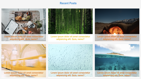
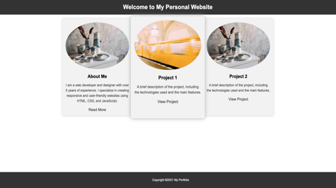
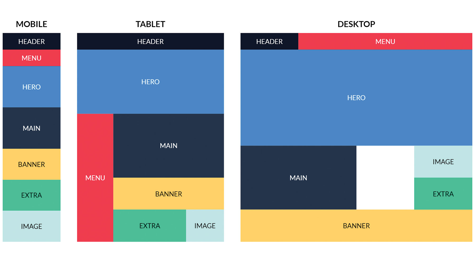
Examples of Responsive Grid Layouts
Now that we've covered the basics of creating a grid layout, let's look at some examples of responsive grid layouts in action.
Conclusion
Creating a responsive grid layout is an essential skill for web designers and developers. By using HTML and CSS, you can create a clean, structured layout for your website that adjusts to different screen sizes. Whether you're creating a portfolio, magazine, or product grid, understanding how to create a responsive grid layout will help you create a better user experience for your website visitors.